Granular Card Controls

UX Design Case Study

Card Controls was a two-phased project for the Account Center platform at Alliance Data. Our goal was to give customers advanced security options for their account, allowing them to control when, where, and how their credit card is used. Phase one focused on adding simple lock/unlock functionality to their account, while phase two was to allow more granular control of their spending. I was the UX lead for both phases of the project.

Company

Alliance Data Card Services

Project Timeframe

Jun - Nov 2018

Responsibilities

  • UX Project Lead
  • User/IA Research
  • User Scenarios
  • Wireframing
  • High Fidelity Design
  • Prototyping
  • User Testing
  • Specification Document

Tools

  • Axure
  • Invision

The Challenge

Granular card controls allows users to receive alerts or automatically decline purchases based on factors such as the purchase type, amount, or location. Compared to the lock/unlock functionality from phase 1, granular card controls is much less commonplace in the industry, giving us an opportunity to design a cutting-edge experience and become a leader in credit card security.

Research

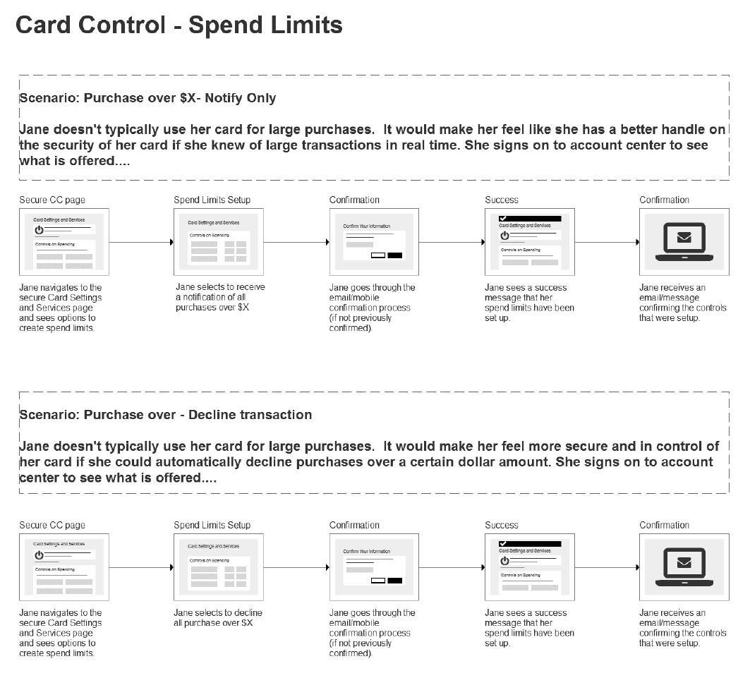
When designing a feature around credit card security, it's crucial to understand the type of mindset or situations our users might be in when using it. Based on our enterprise persona "Jane", I brainstormed the possible scenarios where she would utilize these granular card controls and created flows of her journey.

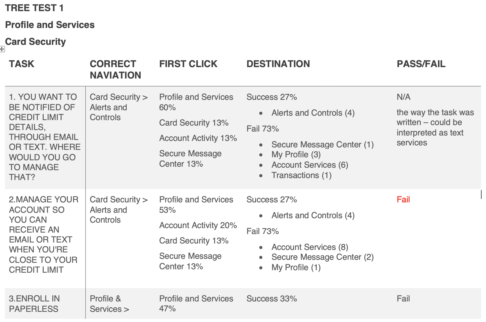
Additionally, I worked with our team's IA specialist to understand where our users might look for this kind of functionality in the existing Account Center navigation. We created both a tree test and card sort exercise for use with usertesting.com, helping us determine that a new nav item was needed for this functionality.

User Scenario Flows

Scenario flows created for the spend limit granular control

Tree Testing Results

Card sort test results

Brainstorming Concepts

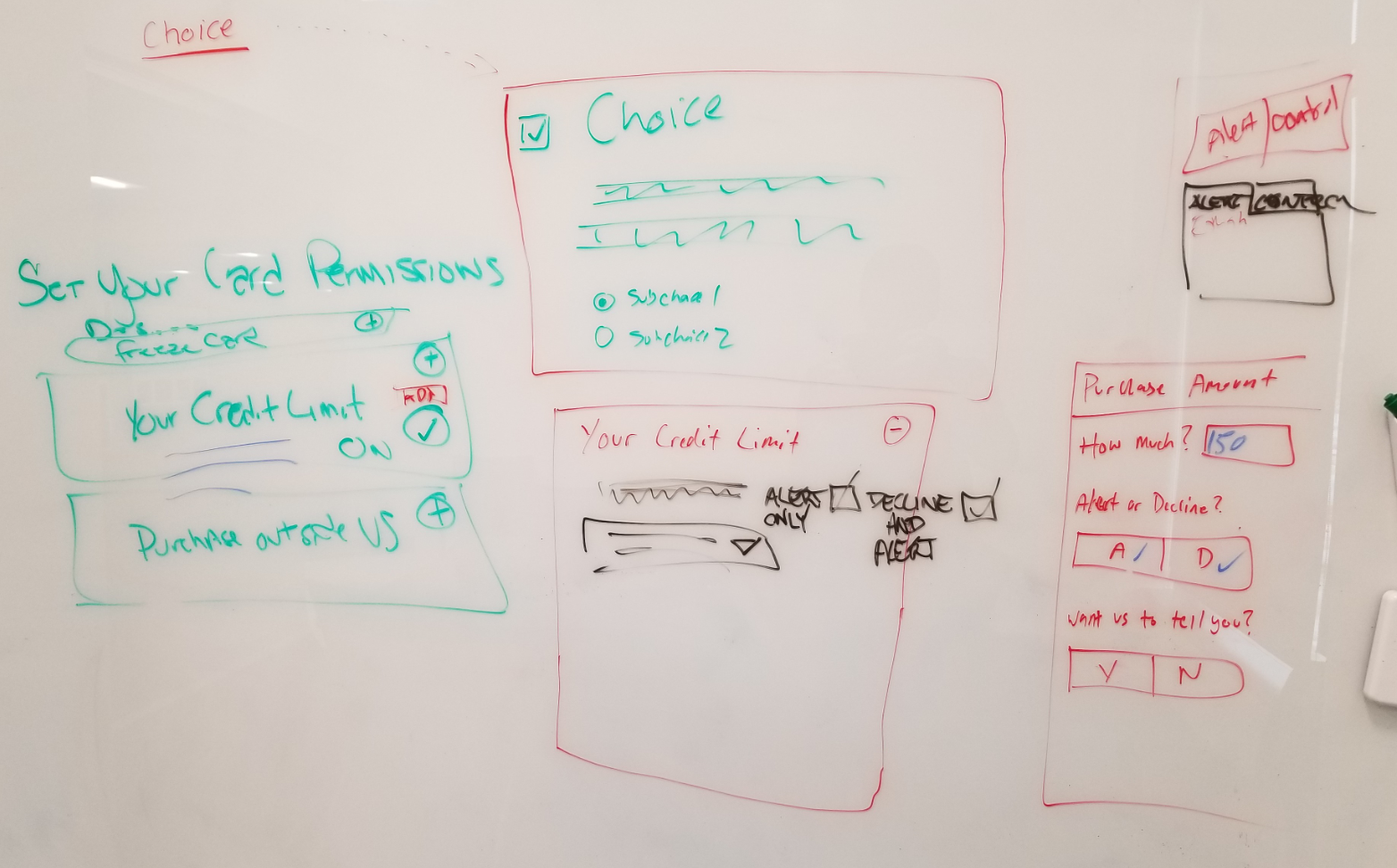
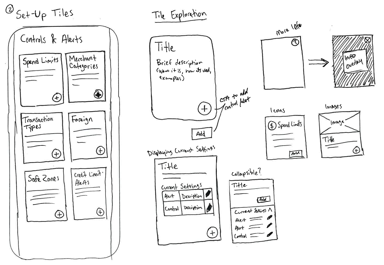
After our research and scenarios, we were ready to begin ideating on conceptual solutions. The UX team along with key project stakeholders came together in group design thinking exercises, where we brainstormed and sketched out ideas. I took our favorite ideas and created low-fidelity sketches, taking the ideas a little further than what we could get to in our session.

Whiteboard concepts from brainstorming sessions

Photo of whiteboard sketches from brainstorming sessions

Low-fi sketches of brainstormed concepts

Screenshot of low fidelity sketches created from concepts

Design & Prototyping

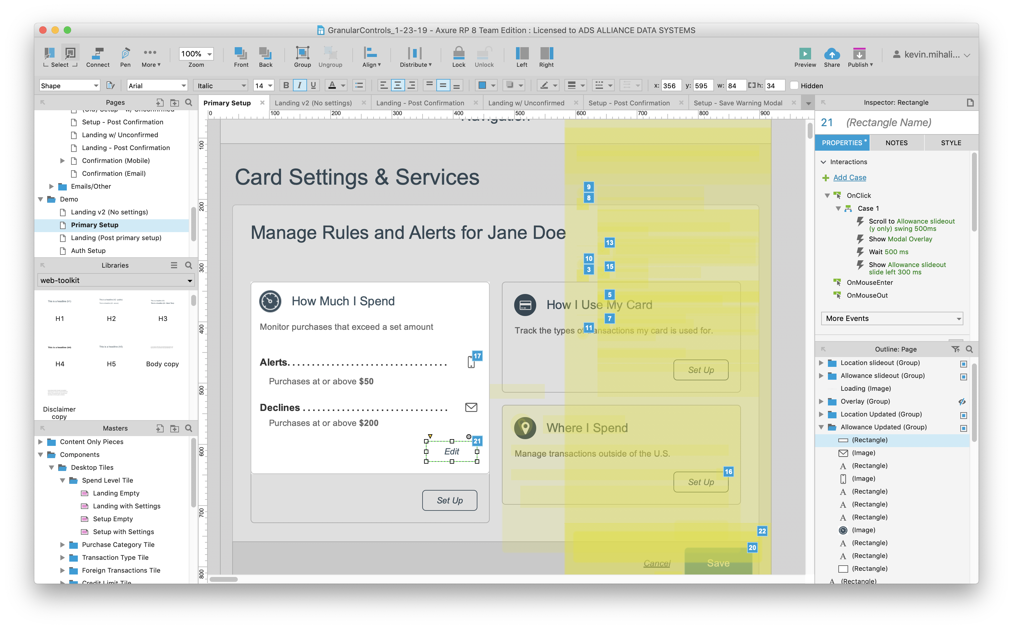
Following concept approval from stakeholders, I created high fidelity mockups and a prototype of the experience using Axure RP. It was important for me to properly illustrate the various new UI interactions involved with this feature, not only to benefit stakeholders and developers, but to also ensure appropriate feedback when conducting usability tests.

High fidelity mockups created in Axure

Screenshot of a granular control mockup in Axure

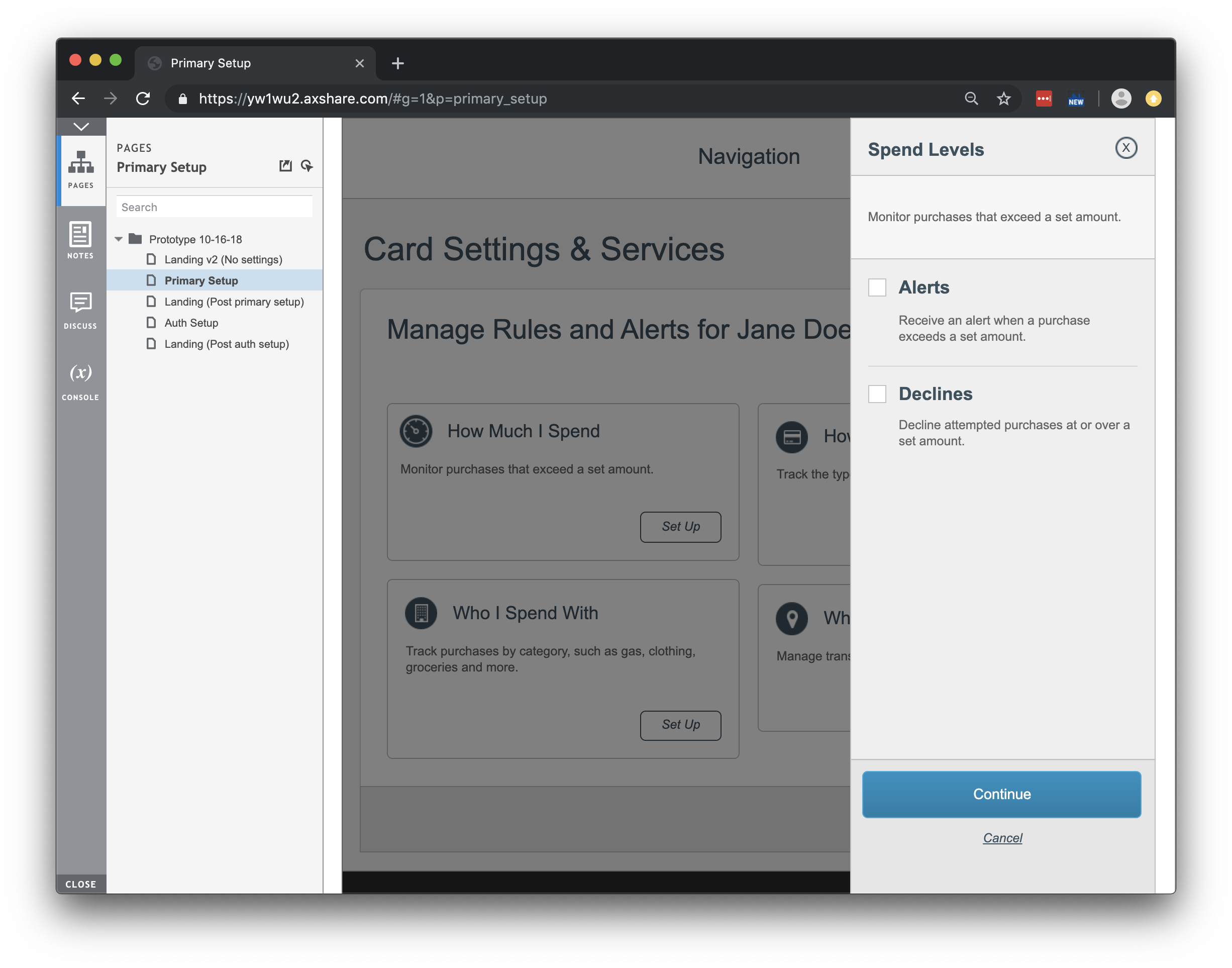
Click to view the desktop prototype

Screenshot of the desktop prototype for granular card controls

Usability Testing

With both mobile and desktop prototypes created, I began working with stakeholders on a test plan. Given that this would be the first time many users would experience this kind of security feature, we had a lot of questions to answer. With UserTesting.com, I distributed a total of 14 tests (8 desktop, 6 mobile) for participants to record and complete remotely. In the test, I gave users a scenario in which they want to either block or be alerted for certain types of purchases, for both themselves and an authorized buyer on their account. The test also included some free form questions to help indicate if the user understood what the feature was and how it worked.

Overall, the test results were extremely positive. All participants were successful in setting up the different granular controls, and all but one accurately described what the feature was and how it worked. The test did bring to light some issues with category naming and CTA placement, but these were easily fixed thanks to the great feedback from test participants.

14 UserTesting.com participants tested both my desktop and mobile prototypes
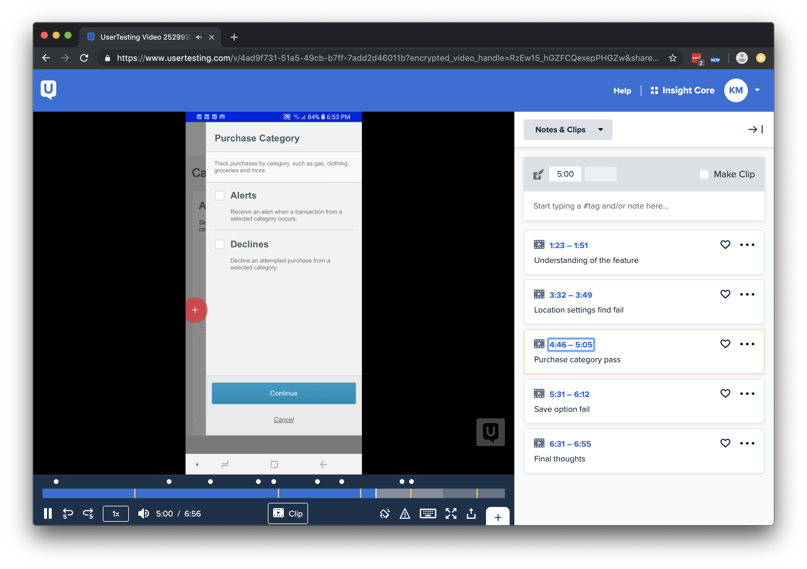
Screenshot of a UserTesting.com test review

Click to review the full test results
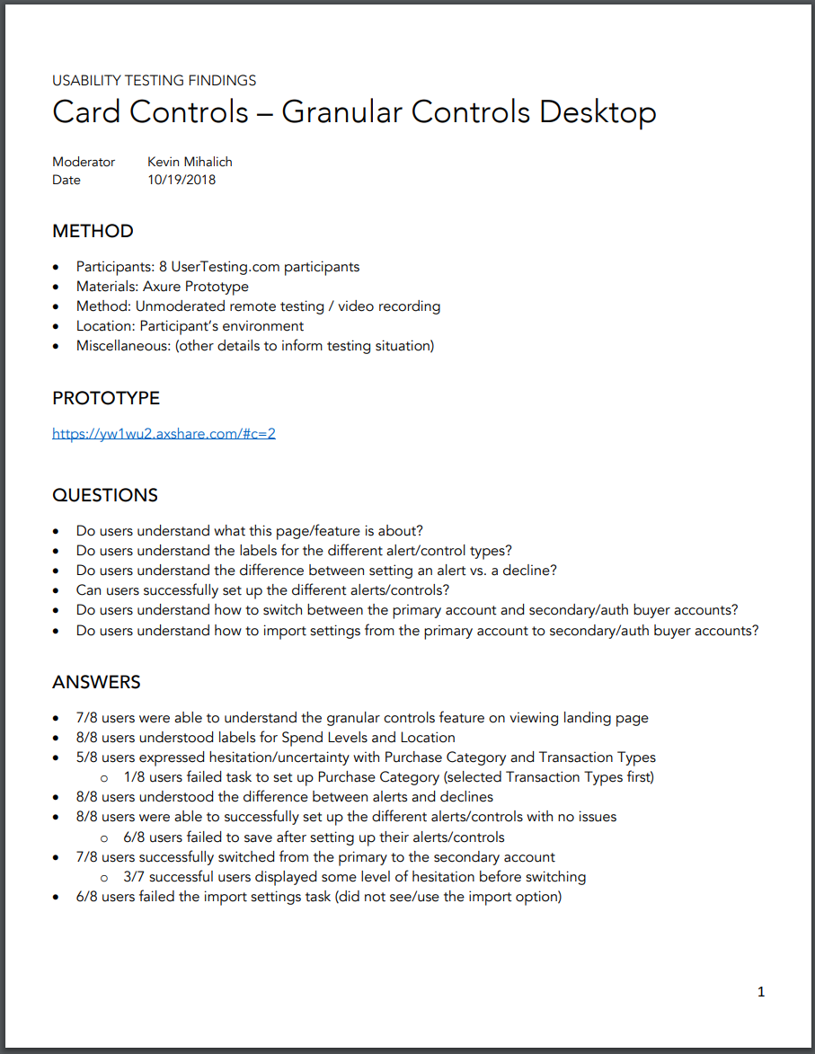
Preview of the Test Results Deliverable

Documentation

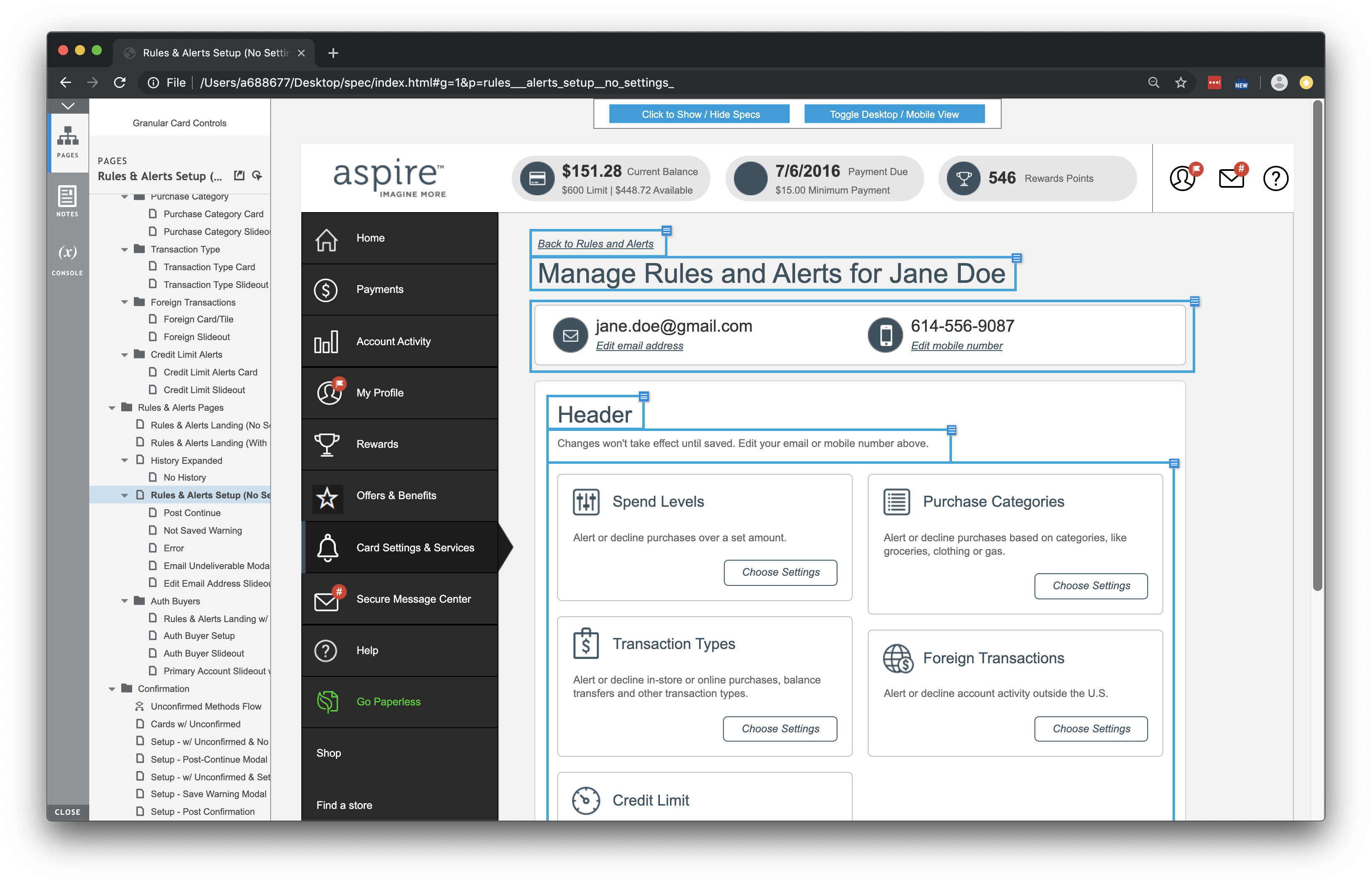
Following testing, I created a specification document that detailed the nuances of the experience for the development team. Due to the new feature's complexity and range of touchpoints across Account Center, this ended up being one of the largest spec documents I've ever had to put together.

The annotated specification document helps clarify functionality and requirements for the development team

Screenshot of the spec document

Status

Granular Card Controls was originally set to go live by April 2019, but issues found during phase one of development have pushed the release back to Q1 2020. As of September 2019 I am no longer with the company, so additional work was left to the Alliance Data UX team.